Desktop Survival Guide
by Graham Williams
|
|
DATA MINING
Desktop Survival Guide by Graham Williams |
|
|||
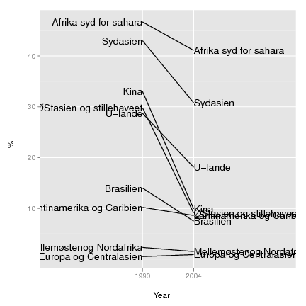
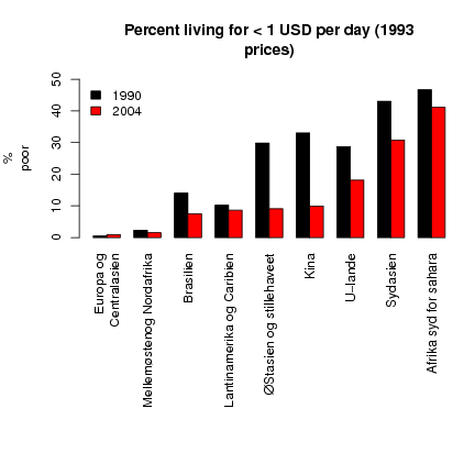
Bump Chart |


|
See http://junkcharts.typepad.com/junk_charts/bumps_chart/ for an example.
> countries <- c("U-lande", "Afrika syd for sahara", "Europa og
  Centralasien", "Lantinamerika og Caribien","Mellemøstenog Nordafrika",
  "Sydasien","ØStasien og stillehaveet", "Kina", "Brasilien")
> poor_1990 <- c(28.7,46.7,0.5,10.2,2.3,43,29.8,33,14)
> poor_2004 <- c(18.1,41.1,0.9,8.6,1.5,30.8,9.1,9.9,7.5)
> poor <- cbind(poor_1990,poor_2004)
> rownames(poor) <- countries
> oldpar <- par(no.readonly=T)
> par <- par(mar=c(15,5,5,1))
> barplot(t(poor[order(poor[,2]),]),beside=T,col=c(1,2),las=3,ylab="%
  poor",main="Percent living for < 1 USD per day (1993
  prices)",ylim=c(0,50))
> legend("topleft",c("1990","2004"),fill=c(1,2),bty="n")
> par(oldpar)
|
And a bump chart or parallel coordinates:
> library(ggplot2)
> # Some data.
>
> countries <- c("U-lande", "Afrika syd for sahara", "Europa og Centralasien",
                 "Lantinamerika og Caribien", "Mellemøstenog Nordafrika",
                 "Sydasien", "ØStasien og stillehaveet", "Kina", "Brasilien")
> poor_1990 <- c(28.7, 46.7, 0.5, 10.2, 2.3, 43, 29.8, 33, 14)
> poor_2004 <- c(18.1, 41.1, 0.9, 8.6, 1.5, 30.8, 9.1, 9.9, 7.5)
> # Reformat the data.
>
> data <- data.frame(countries, poor_1990, poor_2004)
> data <- melt(data,id=c('countries'), variable_name='year')
> levels(data$year) <- c('1990', '2004')
> # Make a new column to make the text justification easier
>
> data$hjust <- 1-(as.numeric(data$year)-1)
> # Start the percentage plot
>
> p = ggplot(data, aes(x=year, y=value, groups=countries))
> # Add the axis labels.
>
> p = p + labs(x='\nYear', y='%\n')
> # Add lines.
>
> p <- p + geom_line()
> # Add the text
>
> p = p + geom_text(aes(label=countries, hjust=hjust))
> #expand the axis to fit the text
> p = p + scale_x_discrete(
          expand=c(2,2)
  )
> #show the plot
> print(p)
> #rank the countries
> data$rank = NA
> data$rank[data$year=='1990'] = rank(data$value[data$year=='1990'])
> data$rank[data$year=='2004'] = rank(data$value[data$year=='2004'])
> #start the rank plot
> r = ggplot(
          data
          ,aes(
                  x=year
                  ,y=rank
                  ,groups=countries
          )
  )
> #add the axis labels
> r = r + labs(
          x = '\nYear'
          , y = 'Rank\n'
  )
> #add the lines
> r = r + geom_line()
> #expand the axis to fit the text
> r = r + scale_x_discrete(
          expand=c(2,2)
  )
> #show the plot
> print(r)
|