
Desktop Survival Guide
by Graham Williams
|
|
DATA MINING
Desktop Survival Guide by Graham Williams |
|
|||
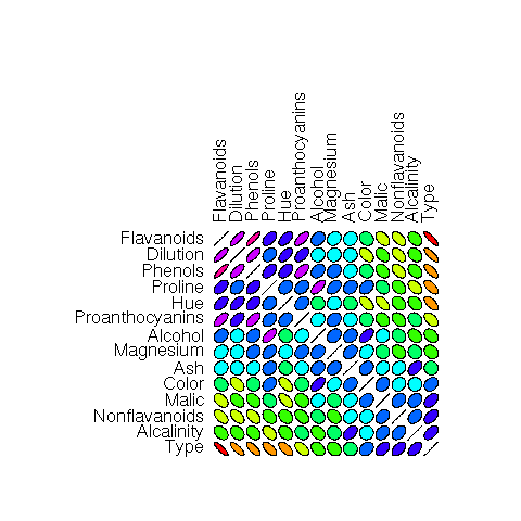
Colourful Correlations |


|
You could write your own path.colors as below and obtain a more colourful correlation plot. The colours are quite garish but it gives an idea of what is possible--The reds and purples give a good indication of high correlation (negative and positive), while the blues and greens identify less correlation.
# Suggested by Duncan Murdoch
path.colors <- function(n, path=c('cyan', 'white', 'magenta'),
                           interp=c('rgb','hsv'))
  {
    interp <- match.arg(interp)
    path <- col2rgb(path)
    nin <- ncol(path)
    if (interp == 'hsv')
    {
      path <- rgb2hsv(path)
      # Modify the interpolation so that the circular nature of hue
      for (i in 2:nin)
        path[1,i] <- path[1,i] + round(path[1,i-1]-path[1,i])
        result <- apply(path, 1, function(x) approx(seq(0, 1,
                        len=nin), x, seq(0, 1, len=n))$y)
        return(hsv(result[,1] %% 1, result[,2], result[,3]))
    }
    else
    {
       result <- apply(path, 1, function(x) approx(seq(0, 1,
                       len=nin), x, seq(0, 1, len=n))$y)
       return(rgb(result[,1]/255, result[,2]/255, result[,3]/255))
    }
  }

pdf('graphics/rplot-corr-wine.pdf')
library(ellipse)
load('wine.Rdata')
corr.wine <- cor(wine)
ord <- order(corr.wine[1,])
xc <- corr.wine[ord, ord]
plotcorr(xc, col=path.colors(11,
               c("red","green", "blue","red"),
               interp="hsv")[5*xc + 6])
dev.off()
|