Desktop Survival Guide
by Graham Williams


|
DATA MINING
Desktop Survival Guide by Graham Williams |

|
|||
Correlation Analysis |


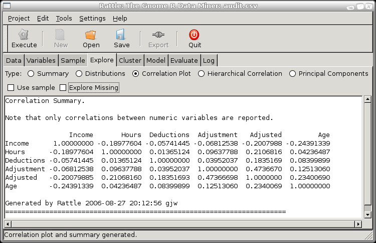
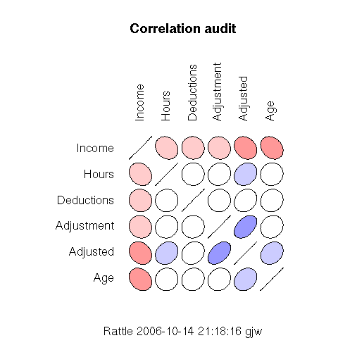
The first thing to notice for this correlation plot is that only the numeric variables appear. Rattle only computes correlations between numeric variables at this time. The second thing to note about the graphic is that it is symmetric about the diagonal. The correlation between two variables is the same, irrespective of the order in which we view the two variables. The third thing to note is that the order of the variables does not correspond to the order in the dataset, but to the order of the strength of any correlations, from the least to the greatest. This is done simply to achieve a more pleasing graphic which is easier to take in.
We interpret the degree of any correlation by both the shape and colour of the graphic elements. Any variable is, of course, perfectly correlated with itself, and this is reflected as the diagonal lies on the diagonal of the graphic. Where the graphic element is a perfect circle, then there is no correlation between the variables, as is the case in the correlation between Hours and Deductions--although in fact there is a correlation, just a very weak one.
The colours used to shade the circles give another (if perhaps redundant) clue to the strength of the correlation. The intensity of the colour is maximal for a perfect correlation, and minimal (white) if there is no correlation. Shades of red are used for negative correlations and blue for positive correlations.

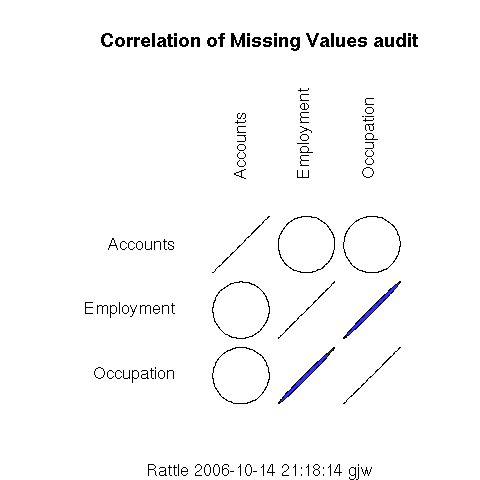
We notice immediately that only three variables are included in this correlation plot. Rattle has identified that the other variables in fact have no missing values, and so there is no point including them in the plot. We also notice that a categoric variable, Accounts, is included in the plot even though it was not included in the usual correlation plot. In this case we can obtain a correlation for categoric variables since we only measure missing and presence of a value, which is easily interpreted as numeric.
The graphic shows us that Employment and Occupation are highly correlated in their presence of missing values. That is, when Employment has a missing value, so does Occupation, and vice versa, at least in general. The actual correlation is 0.995 (which can be read from the Rattle text view window), which is very close to 1.
On the other hand, there is no (in fact very little at 0.013) correlation between Accounts and the other two variables, with regard missing values.
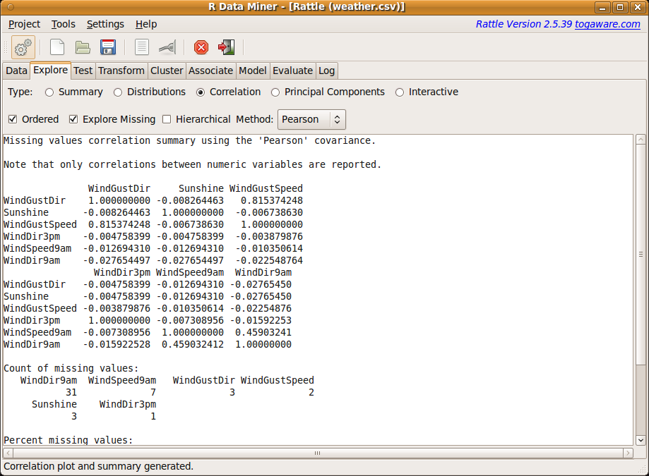
It is important to note that the correlations showing missing values may be based on very small samples, and this information is included in the text view of the Rattle window. For example, in this case we can see in Figure 6.4 that there are only 21 missing observations for WindDir9am and only 2 or 3 for the other variables. This corresponds to approximately 8% and 1% of the observations, respectively, having missing values for these variables. This is too little to draw too many conclusions from.
 |