Desktop Survival Guide
by Graham Williams


|
DATA MINING
Desktop Survival Guide by Graham Williams |

|
|||
Histogram |
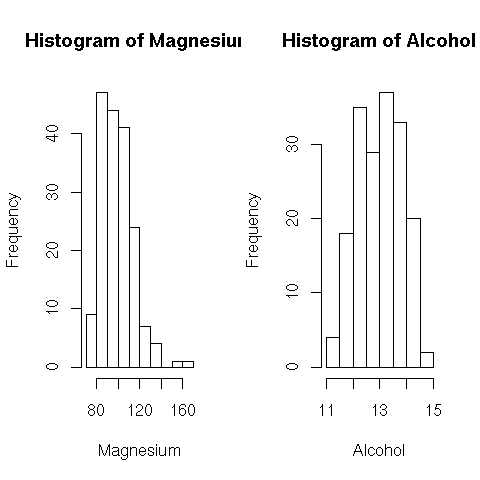
A histogram allows the basic distribution of the data to be viewed. Here we plot the histogram for magnesium and alcohol content of various wines, and we might compare it with the previous stem-and-leaf plot which summarises the same data. The shape is basically the same, although in detail they go up and down at different points!

attach(wine) par(mfrow=c(1, 2)) hist(Magnesium) hist(Alcohol) |
Also, from Rattle, we have:
pdf("graphics/rattle-audit-explore-dist-hist-income.pdf")
library(rattle)
library(vcd)
data(audit)
ds <- audit$Income
hs <- hist(ds, main="", xlab="",
           col=rainbow_hcl(25, start = 270, end = 150),
           breaks="scott", border=FALSE)
dens <- density(ds)
|