Desktop Survival Guide
by Graham Williams


|
DATA MINING
Desktop Survival Guide by Graham Williams |

|
|||
Practical Histogram |
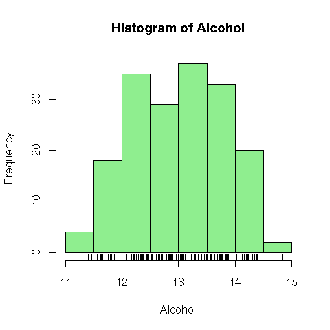
Suppose we are interested in the distribution of the Alcohol content in the wine dataset. The numeric values are grouped by hist into intervals and the bars represent the frequency of occurrence of each interval as a height. A rug is added to the plot, just above the x-axis, to illustrate the density of values.

pdf('graphics/rplot-hist-colour.pdf')
load("wine.Rdata")
attach(wine)
hist(Alcohol, col='lightgreen')
rug(Alcohol)
dev.off()
|