Togaware DATA MINING
Desktop Survival Guide
by Graham Williams
Google


Risk Chart Option

Image rattle-evaluate-riskchart-auc
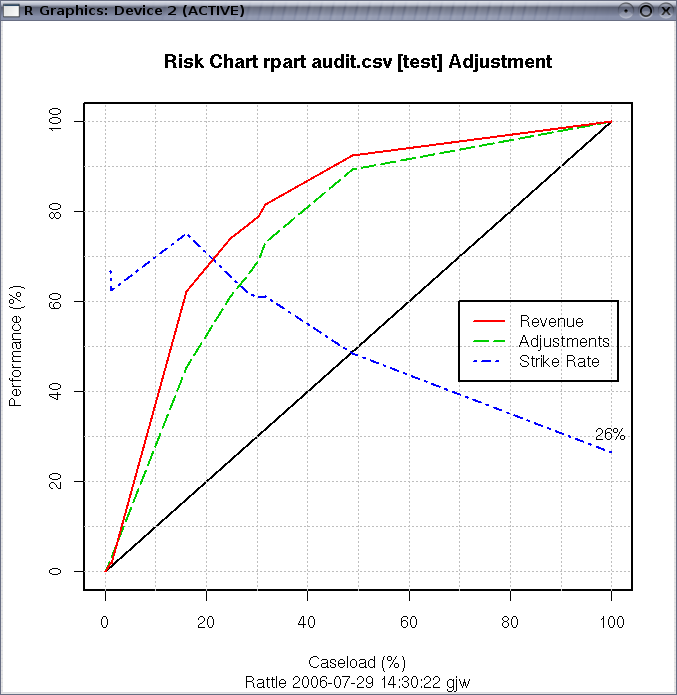
We have introduced the idea of a Risk Chart to communicate the effectiveness of a model when each entity has associated with it a risk value. For example, for revenue (or tax) authorities, the outcomes of audits include a dollar amount by which the tax obligation of the taxpayer has been changed (which may be a change in favour of the revenue authority or in favour of the taxpayer). For fraud investigations, the outcome might be the dollar amount recovered from the fraud. It is often useful to see the tradeoff between the return on investment and the number of cases investigated.

Image rattle-evaluate-riskchart-audit-rpart
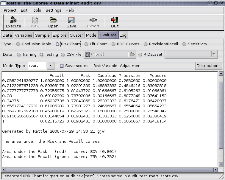
When a Risk Chart is generated the text window in Rattle will display the aggregated data that is used to construct the plot. This data consists of a row for each level of the probability distribution that is output from the model, ordered from the lowest probability value to a value of 1. For each row we record the model performance in terms of predicting a class of 1 if the probability cutoff was set to the corresponding value.

For example, we might choose a cutoff to be a probability of 0.28 so that anything predicted to be in class 1 with a probability of 0.28 or more will be regarded as in class 1. Then the number of predicted positives (or the Caseload) will be 30% (0.301667) of all cases. Amongst this 30% of cases are 69% of all true positives and they account for 79% of the total of the risk scores. The strike rate (number of true positives amongst the positives predicted by the model) is 61%. Finally, the measure reports the sum of the distances of the risk and recall from the baseline (the diagonal line). This measure can indicate the optimal caseload in terms of maximising both risk recovery and recall.

Copyright © Graham.Williams.com
Support further development through the purchase of the PDF version of the book.
Brought to you by Togaware.