Desktop Survival Guide
by Graham Williams


|
DATA MINING
Desktop Survival Guide by Graham Williams |

|
|||
|
ACTUALLY KNOWN AS CUMULATIVE GAIN CHARTS. PERHAPS LABEL SHOULD BE ``Gain'', NOT ``Risk''.


A risk chart is particularly useful in the context of the
audit dataset, and for risk analysis tasks in
general. Already we have noted that this dataset has a two class
target variable, Adjusted. We have also identified a so
called risk variable, Adjustment, which is a
measure of the size of the risk associated with each observation. Entities
that have no adjustment following an audit (i.e., they are clients who
have supplied the correct information) will of course have no risk
associated with them (Adjustment ![]() ). Entities that do
have an adjustment will have a risk associated with them, and for
convenience we simply identify the value of the adjustment as the
magnitude of the risk
). Entities that do
have an adjustment will have a risk associated with them, and for
convenience we simply identify the value of the adjustment as the
magnitude of the risk
In particular, we can think of revenue (or tax) authorities, where the outcomes of audits include a dollar amount by which the tax obligation of the taxpayer has been changed (which may be a change in favour of the revenue authority or in favour of the taxpayer). For fraud investigations, the outcome might be the dollar amount recovered from the fraudster. In these situations it is often useful to see the tradeoff between the return on investment and the number of cases investigated.
Rattle introduces the idea of a risk chart to evaluate the performance of a model in the context of risk analysis.
A risk chart plots performance against caseload. Suppose we had a population of just 100 entities (audit cases). The case load is the percentage of these cases that we will actually ask our auditors to process. The remainder we will not consider any further, expecting them to be low risk, and hence, with limited resources, not requiring any action. The decision as to what percentage of cases are actually actioned corresponds to the X axis of the risk chart - the caseload. A 100% caseload indicates that we will action all audit cases. A 25% caseload indicates that we will action just one quarter of all cases.
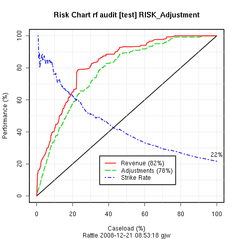
For a given testing population we know how many cases resulted in adjustments. We also know the magnitude of those adjustments (the risk). For a population of 100 cases, if we were to randomly choose 50% of the cases for actioning, we might expect to recover just 50% of the cases that actually did require an adjustment and 50% of the risk (or in this case, the revenue) recovered from these adjusted cases. Similarly for every caseload value: for a random caseload of 25% of the population we might expect to recover 25% of the adjustments and revenue. The diagonal black line of the risk chart represents this random selection, and can be thought of as the baseline against which to compare the performance of our models.
Any model that Rattle builds in the two-class paradigm generates a risk score for each observation. This is generally the probably of the case requiring an adjustment. We can use this score to sort all of the cases in decreasing order of the score. In selecting cases to be actioned, we then start with those cases that have the highest score. Thus, in evaluating the performance of our model, the caseload axis represents the sorted list of cases, from the highest scored cases at the left (starting at 0% of the cases actioned), and the lowest at the right (ending with 100% of the cases actioned).
The green (dashed) line of a risk chart then records the percentage of adjusted cases that we would actually expect to identify for a given percentage of the caseload. In the risk chart above, for example, we can see that if we only actioned the top 20% of the cases, as scored by our model, we recover almost 60% of the cases that actually did require an adjustment. Similarly, for an 80% caseload we can recover essentially all of the cases that required adjustment. Hence our model can save us 20% of our caseload (i.e., 20% of our resources) whilst pretty much recovering all of the adjustments.
The red (solid) line similarly records the percentage of the total revenue (or risk) that is recovered for any particular caseload. In our example above we see that the red and green lines essentially follow each other. This is not always the case.
EXPLAIN THE REVENUE AND STRIKE RATES. EXPLAIN THE AUC.
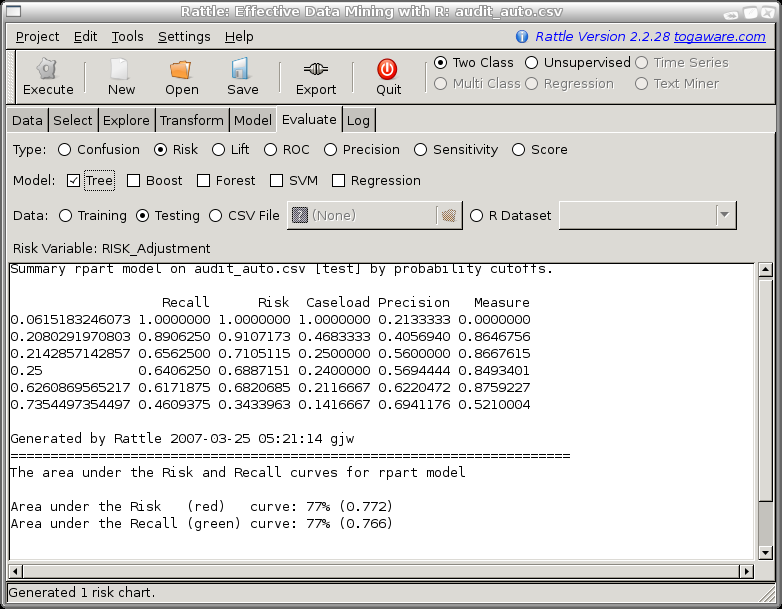
When a Risk Chart is generated the text window in Rattle will display the aggregated data that is used to construct the plot. This data consists of a row for each level of the probability distribution that is output from the model, ordered from the lowest probability value to a value of 1. For each row we record the model performance in terms of predicting a class of 1 if the probability cutoff was set to the corresponding value.
For example, we might choose a cutoff to be a probability of 0.28 so that anything predicted to be in class 1 with a probability of 0.28 or more will be regarded as in class 1. Then the number of predicted positives (or the Caseload) will be 30% (0.301667) of all cases. Amongst this 30% of cases are 69% of all true positives and they account for 79% of the total of the risk scores. The strike rate (number of true positives amongst the positives predicted by the model) is 61%. Finally, the measure reports the sum of the distances of the risk and recall from the baseline (the diagonal line). This measure can indicate the optimal caseload in terms of maximising both risk recovery and recall.

Like ROC curves, we need to be careful in the use of risk charts for selecting cut points. We note that the area under the ROC curve is a good measure of predictive discrimination, but in comparing models it may not be sensitive enough.
Copyright © Togaware Pty Ltd Support further development through the purchase of the PDF version of the book.