
Desktop Survival Guide
by Graham Williams
|
|
DATA MINING
Desktop Survival Guide by Graham Williams |
|
|||
Basic Bar Chart |


|
A bar chart is useful to illustrate distributions of the population.
In the following bar chart five classes of patient disease groups are
identified, and a distribution of three age groups is shown for each
disease group.
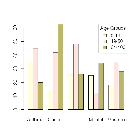
bars <- matrix(c(35, 15, 26, 25, 18,
                 45, 42, 48, 12, 35,
                 20, 63, 26, 34, 28), nrow=3, byrow=T)
rownames(bars) <- c("0-19", "19-60", "61-100")
colnames(bars) <- c("Asthma", "Cancer", "Diabetes", "Mental", "Musculo")
col <- c("lightyellow", "mistyrose","darkkhaki")
barplot(bars, beside=TRUE, col=col)
legend("topright", rownames(bars), title="Age Groups", fill=col)
|