
Desktop Survival Guide
by Graham Williams
|
|
DATA MINING
Desktop Survival Guide by Graham Williams |
|
|||
Matrix Data |


|
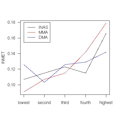
The following example illustrates the use of a matrix as the source of the data to be plotted. The matrix has three columns, one for each of the items of interest. The rows correspond to observations. We want to plot the values for each item across the observations, joingin the points with a line. Key features to note include the axis labels always being horizontal (las=1) and each line being a solid line (lty=1).
# Suggested by Chuck Cleland
pdf("graphics/rplot-matplot.pdf")
  myFrame <- data.frame(lowest = c(0.107, 0.091, 0.126),
                        second = c(0.115, 0.107, 0.103),
                        third = c(0.123, 0.115, 0.126),
                        fourth = c(0.115, 0.142, 0.129),
                        highest = c(0.166, 0.179, 0.142),
                        sig = c(0.000, 0.000, 0.031))
  rownames(myFrame) <- c("INAS", "MMA", "DMA")
  par(las=1)
  matplot(t(myFrame[,-6]), type="l", xaxt="n", ylab="INMET",
          col=c("black", "red", "blue"), lty=c(1,1,1))
  axis(side=1, at=1:5, names(myFrame)[1:5])
  legend(1, 0.18, rownames(myFrame), lty=c(1,1,1),
         col=c("black", "red", "blue"))
dev.off()
|