Desktop Survival Guide
by Graham Williams


|
DATA MINING
Desktop Survival Guide by Graham Williams |

|
|||
|
A pie chart partitions a circle into proportions related to some data. The R function pie is used to produce a pie chart. A pie chart can be used to display the proportion of entities spread across some partitioning of the dataset. In French, they are referred to as le camembert (as in the round cheese), and in Danish, as Lagkagediagram (traditional layer cakes).
Pie charts are a perennial favourite even though many graphic data display experts dislike them (including ()). The general concern is that the human eye is not well suited to differentiating angular variations and a bar chart provides a better alternative. However, many people still find value in a pie chart, and as long as a high level of precision is not required, they have a role to play.
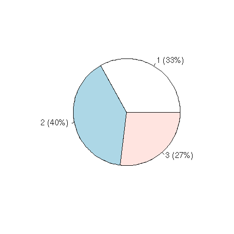
In our example, using the wine dataset, the data is
partitioned on categoric variable Type. The default plot
produced by pie will produce quite a respectable looking
pie chart. We add in to the basic plot the percentage of entities in
each category, including this with the labels of the pie chart. This
helps in communicating the distribution of the data over Type.

load("wine.Rdata")
attach(wine)
percent <- round(summary(Type) * 100 / nrow(wine))
labels <- sprintf("%s (%d%%)", levels(Type), percent)
pie(summary(Type), lab=labels)
|
Copyright © Togaware Pty Ltd Support further development through the purchase of the PDF version of the book.